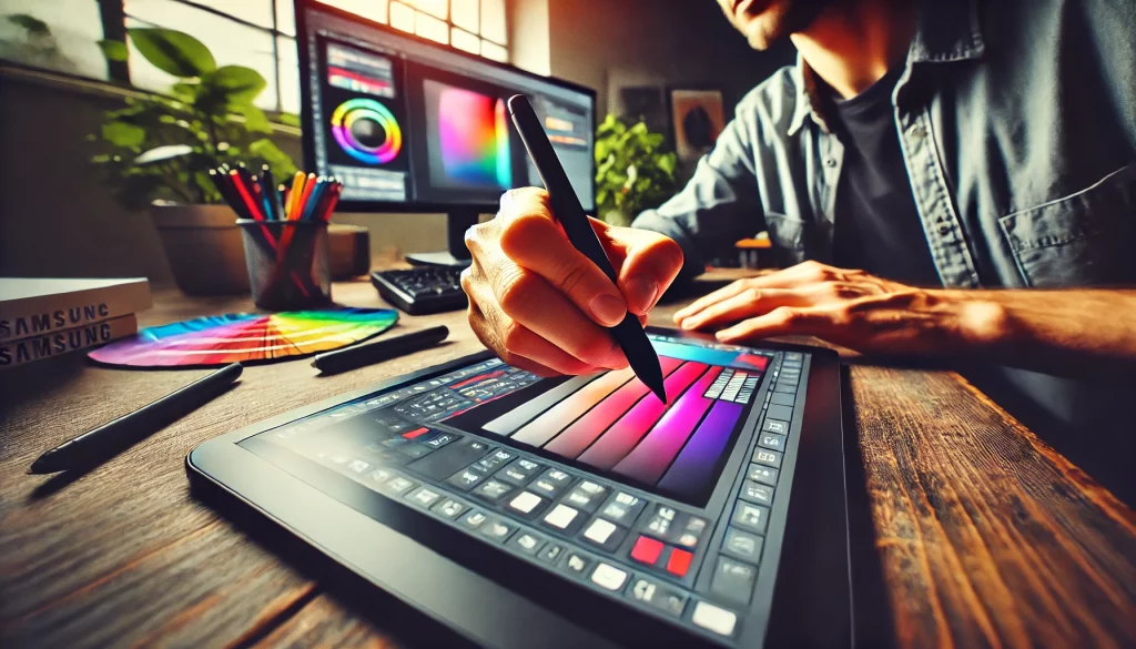
As a graphic designer, gradients are an essential part of my design toolkit. They add depth, dimension, and emotion to my work, transforming simple visuals into captivating pieces of art. Over the years, I’ve experimented with countless gradient mixtures, each bringing its unique vibe to my projects. In this blog post, I’ll share some of my all-time favorite gradient mixtures that have consistently brought my designs to life.
1. Sunset Glow
Colors: #ff7e5f → #feb47b
The Sunset Glow gradient is a classic blend of warm orange and soft peach tones. It evokes the warmth and serenity of a sunset, making it perfect for designs that aim to convey calmness, optimism, or a touch of romance. I love using this gradient in backgrounds for websites, app interfaces, or even posters where a soothing atmosphere is needed.
2. Ocean Breeze
Colors: #00c9ff → #92fe9d
The Ocean Breeze gradient is a refreshing combination of cool blue and soft green hues. This mixture reminds me of a peaceful day by the sea, with gentle waves lapping at the shore. It’s an ideal choice for designs related to nature, wellness, or technology, where a clean and fresh aesthetic is desired. I often use this gradient in branding materials and digital art.
3. Midnight Aurora
Colors: #4b6cb7 → #182848
Midnight Aurora is a deep, mysterious gradient that transitions from a rich blue to a dark indigo. This gradient captures the essence of the night sky, filled with possibilities and hidden wonders. It’s a fantastic choice for projects that require a touch of elegance, sophistication, or intrigue. I frequently use Midnight Aurora in event flyers, album covers, and website headers to create a dramatic effect.
4. Tropical Sunrise
Colors: #ff9a9e → #fad0c4
Tropical Sunrise is a delightful blend of soft pinks and peachy oranges. This gradient exudes warmth and joy, reminiscent of early morning sunrises in a tropical paradise. It’s a go-to for designs that need to convey happiness, positivity, or a playful vibe. I love using this gradient in social media graphics, product packaging, and children’s illustrations.
5. Urban Twilight
Colors: #8e2de2 → #4a00e0
Urban Twilight is a striking gradient that shifts from a vibrant purple to a deep violet. This mixture is perfect for modern, edgy designs that aim to stand out. It brings a sense of energy and dynamism to any project. I often use Urban Twilight in fashion branding, music posters, and tech-related visuals where a bold, futuristic look is required.
6. Forest Whisper
Colors: #5a3f37 → #2c7744
Forest Whisper is a rich, earthy gradient that transitions from deep brown to lush green. This gradient captures the essence of the forest, evoking feelings of grounding and connection to nature. It’s perfect for eco-friendly brands, outdoor adventure themes, or any project that wants to highlight sustainability. I often use Forest Whisper in logo designs, packaging, and editorial layouts.
7. Candy Dreams
Colors: #fcb045 → #fd1d1d → #833ab4
Candy Dreams is a playful, vibrant gradient that moves from a bright orange to pink and ends in a deep purple. This mixture is perfect for designs that need to be fun, energetic, and eye-catching. I love using this gradient in promotional materials, social media posts, and youth-oriented branding. It’s a surefire way to bring a sense of fun and excitement to any project.
Conclusion
Gradients are more than just color transitions—they are powerful tools that can evoke emotion, create atmosphere, and define the overall aesthetic of a design. The gradients I’ve shared here are just a few of my favorites, each bringing its own unique character to my work. Whether you’re designing for digital, print, or something in between, the right gradient can make all the difference. I encourage you to experiment with these mixtures and discover how they can elevate your creative projects. Happy designing!