When it comes to graphic design, color isn’t just decoration—it’s communication. The colors we choose can evoke emotions, highlight important elements, and even influence decisions. This is where color theory comes into play.
In this post, I’ll walk you through the basics of color theory in graphic design, and show you how to apply it with practical examples.
What is Color Theory?
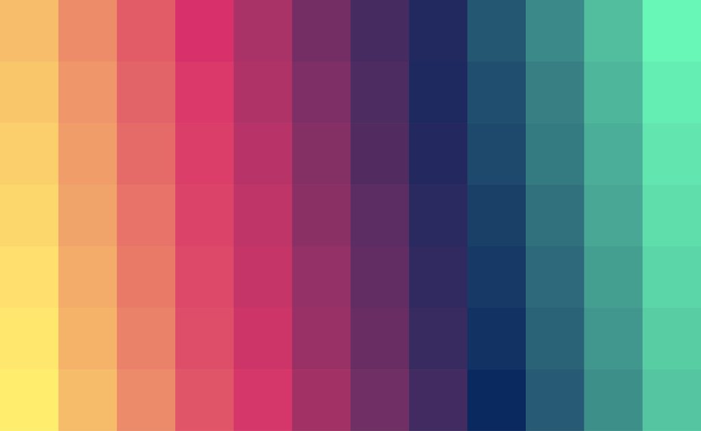
Color theory is the science and art of using color. It explains how colors interact, mix, and contrast with each other, and it provides us with guidelines to create visually appealing designs. At the core of color theory lies the color wheel, which organizes colors into a circular chart, showing the relationships between primary, secondary, and tertiary colors.
- Primary colors: Red, Blue, Yellow
- Secondary colors: Green, Orange, Purple (made by mixing two primaries)
- Tertiary colors: Mix of a primary and a secondary (e.g., blue-green, red-orange)
Key Color Harmonies Every Designer Should Know
Here are some fundamental color schemes you’ll often use in graphic design:
1. Monochromatic
Using different shades, tints, and tones of a single color.
👉 Example: A web design using different blues for background, buttons, and headings creates a clean, calming effect.
2. Analogous
Colors that sit next to each other on the color wheel.
👉 Example: Yellow, yellow-green, and green in a nature-themed poster feel harmonious and soothing.
3. Complementary
Colors opposite each other on the color wheel.
👉 Example: Orange and blue in a sports logo make elements pop because of their strong contrast.
4. Triadic
Three colors evenly spaced around the wheel.
👉 Example: Red, yellow, and blue in a children’s toy packaging design create energy and playfulness.
5. Split-Complementary A base color plus two colors next to its complement.
👉 Example: Purple with yellow-green and yellow-orange for a more balanced yet striking design.
Color Psychology in Design
Beyond harmony, colors carry psychological meanings:
- Red: Excitement, urgency, passion (think sale signs).
- Blue: Trust, calm, professionalism (used heavily by banks and tech companies).
- Green: Growth, health, eco-friendly (perfect for wellness and sustainability brands).
- Yellow: Optimism, cheerfulness, creativity.
- Black: Power, elegance, luxury.
👉 Example: A health app might use green and white to signal wellness and simplicity, while a luxury brand may stick with black and gold for sophistication.
How to Apply Color Theory in Graphic Design
- Start with a purpose – Ask: What feeling do I want to evoke?
- Choose a color scheme – Use the color wheel as your guide.
- Create contrast – Make sure important elements (like CTAs) stand out.
- Stay consistent – Stick to a palette to build a strong brand identity.
👉 Example: In a social media ad, you might use a complementary scheme (like teal and orange) so that your product image (orange) immediately grabs attention against the background (teal).
Final Thoughts
Color theory isn’t about memorizing rules—it’s about understanding how color works so you can use it intentionally. The right palette can transform a design from average to unforgettable. So next time you start a project, spend a few minutes exploring the color wheel. Your designs will thank you for it.